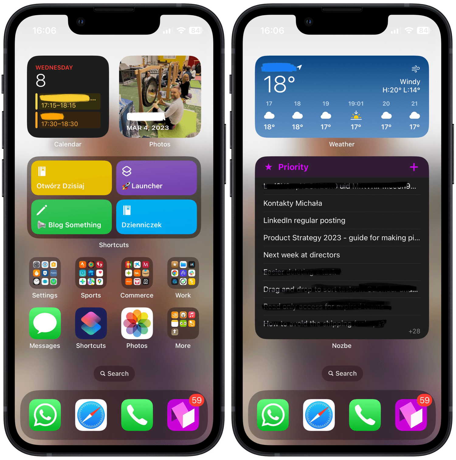
In 2023 my iPhone Mini has just ONE home screen
📲iPhone,✔️Productivity,⭐️Featured
Three years ago I published the details of my iPhone 12 Mini Home Screen and I’ve had basically that same app layout on that Mini, later on the iPhone 13 Pro and then on my new Mini. Only this year I decided to shake things up and reduce the Home Screen to just ONE SCREEN and that’s it:

THREE Widgets…
The top part of the iPhone consists of just three widgets:
- Calendar widget - so that I know what’s coming.
- Photos widget - because it surprises me every day with new photos, much like the iOS16 Lock screen
- Shortcut widget that has two of my journaling shortcuts (in Polish), a “Launcher” shortcut that launches some additional handy shortcuts that I might need and a “blog something” shortcut that prompts me to write something for this blog.
FIVE folders with apps…
As I use my cute ultra Mini one-handed most of the time, I want to be able to reach to the apps with my thumb, so I put the apps in folders:
- Settings - Settings, 1Password, HomeKit apps, Clock and FindMy (as I have so many AirTags!)
- Sports - Strava, Fitness, PhoneGap, and other health-related apps I use frequently together with Apple and Google maps.
- Commerce - various banking apps, Amazon and Allegro as well as Polish ID app (mObywatel).
- Work - Reeder, iA Writer, Files app, Hey for email, Chrome as Safari alternative, Slack, Working Copy for GitHub, Nozbe Personal and Soulver (my favorite pocket calculator).
- More - additional apps I use for listening (Audible for audiobooks and Overcast for podcasts and Apple Music), Notepad, Duo Lingo and Bible (After I took the screenshot I added Ivory for Mastodon to this folder).
SEVEN apps I use all the time…
These apps I need to be able to access with one tap:
- Messages - I use iMessage all the time!
- Shortcuts - I have 78 Siri Shortcuts in my library and need to be able to access them easily.
- Photos - I take lots of them!
- WhatsApp - my main way to communicate with groups of people or with folks who don’t have Apple devices.
- Safari - the web, of course.
- Phone - and iPhone is still, technically a phone.
- Nozbe - the app that helps me maintain my work-life balance - where I organize my business and private tasks. BTW, I’m also the owner and CEO of it :)
OK, there’s also a second screen!
I wasn’t technically untrue. I do have just one screen with apps but I decided to dedicate the second screen to two additional widgets:
- Weather widget - which is very useful!
- Nozbe Priority view widget - which helps me stay focused on my tasks for the day. Plus it allows me to quickly add an additional task to the list if I want to. This widget is a very cool thing - I don’t need to open Nozbe to know what I should be working on!
So far so good - I like my minimalist iPhone Home Screen!
I really like my setup now:
- The iPhone 13 Mini which is super fast
- The Lock Screen that surprises me with photos every hour
- And just one Home Screen with apps and another with tasks!
And what’s your iPhone or Android Home Screen set up this year?