My new minimalist iPhone 12 Mini Home Screen for 2020
📲iPhone,✔️Productivity
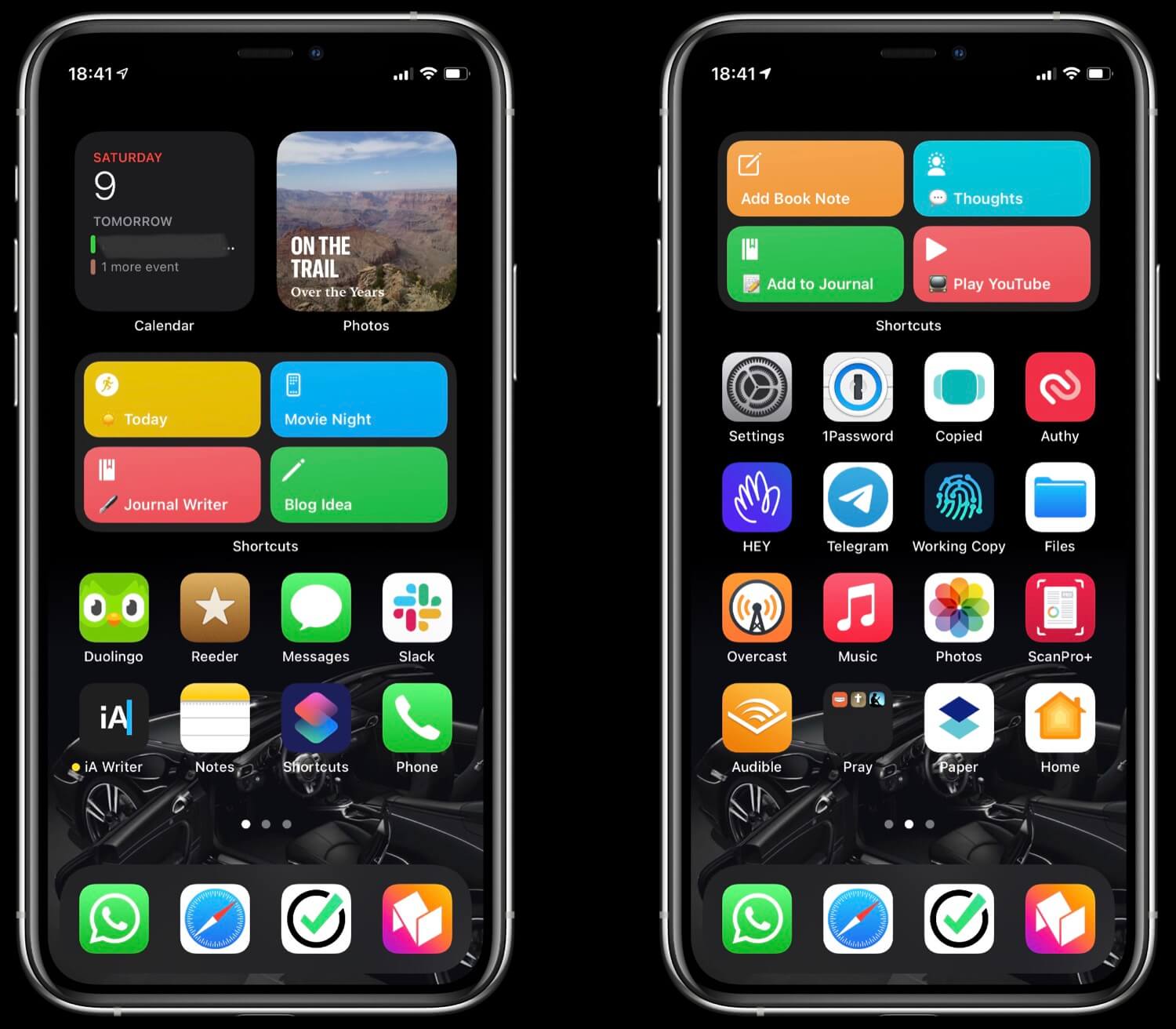
Now after I’ve posted the details of my iPad Pro 11” home screen it’s time to share the Home Screen of my cute iPhone 12 Mini. As I was doing my annual review I decided to also simplify and reduce the number of apps on my iPhone’s screen as well as embrace the two things iOS14 was all about - the widgets and the app directory. Here’s the result:

- Fewer screens of apps and widgets. The rest goes to the App directory.
- Screen 1 - it’s about creating, working and not just consuming!
- Screen 2 - more apps I use daily
- Compared to my Home Screen from 2020 I think it looks way better!
- Bonus: iPhone Mini review after a few months
- Bonus 2: new iPhone Mini cases - Mujjo and Apple MagSafe Wallet!
Fewer screens of apps and widgets. The rest goes to the App directory.
Up until now I had 4 screens full of apps. Now I reduced the number of screens to three (you can see first two ones on the screenshot above) with much fewer apps.
Over the last year I realized I was launching lots of apps directly from “search”. I’d just pull down the screen and find the app I wanted to launch. That’s why apps I’m launching rarely don’t no need to be on the main home screen and clutter the space.
I just tap to delete them, and tap to “Remove from Home Screen” and to the App directory off it goes! I’ve also switched the setting that all the new apps downloaded from the App Store go the App Directory as well!
As for the widgets, I’m still playing with them. I haven’t embraced them fully but I’m testing them out. As much as my cute iPhone mini can be used one-handed, I find it hard to reach the top rows of apps, so it’s actually pretty neat to put the widgets at the top of the screen.
Screen 1 - it’s about creating, working and not just consuming!
I want my iPhone to tempt me to create stuff. To do something useful when I pull it out of my pocket. And not to tempt me to mindlessly scroll through things I might not really care about.
That’s why the first screen of my iPhone shows three widgets:
- Calendar widget with upcoming events. Added bonus of having this widget is that you don’t need the Calendar app anymore as to launch the calendar you just tap on the widget itself.
- Photos widget always with a surprising photo or moment to show.
- Shortcuts widget featuring my new journaling workflow. I have the same set of shortcuts as a widget on my iPad Pro.
Right below it I’ve got my 8 most used apps:
- Duolingo - as I’m still trying to learn French. We discussed this on The Podcast in episode 125 as well as 120 and 119.
- Reeder - I subscribe to my favorite blogs with RSS and also use this app as a read-it-later list. As described in detail here.
- Messages and Slack - to communicate with my friends and my team members.
- iA Writer - app I use for all of my writing. Including this blog post. And my upcoming #NoOffice book.
- Notes - I switched to it from Evernote.
- Shortcuts - to have access to all of my shortcuts.
- Phone - an app I very rarely use on my iPhone 😜
And in my dock:
- WhatsApp - the main messaging app I use with my family and everyone around me.
- Safari
- Nozbe Personal - for my personal tasks.
- Nozbe Teams - for my team’s shared projects and tasks.
So basically, the main screen describes me in a nutshell:
He learns languages, he reads blogs, he writes a lot, he communicates with people much and he’s all about personal and team productivity.
Yep. That’s me.
Screen 2 - more apps I use daily
The second screen is still filled with quite a few apps which I use most of the time. There’s a widget with Shortcuts at the top which among other things features my YouTube player followed by four rows of apps:
- Settings, 1Password where I store passwords, Copied where I save multiple clipboard items and Authy for all two-factor authentication needs.
- Hey for email, Telegram as a WhatsApp alternative, Working Copy for my GitHub access and Files.
- Overcast for podcasts, Music, Photos and a document Scanner app.
- Audible for listening to books, folder with apps I use for prayer, Dropbox Paper where we store all of our team’s documentation and Home app to control all of my HomeKit devices.
Compared to my Home Screen from 2020 I think it looks way better!
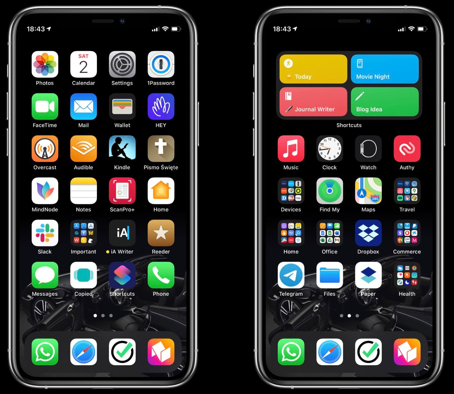
Here’s my Home Screen from last year. Too many apps, too many folders, too much clutter:

Bonus: iPhone Mini review after a few months
I heard rumors that the iPhone Mini is not selling well. I hope that’s not entirely true because next year if possible I’d love to be able to upgrade it to the iPhone 13 Mini. I simply love this thing. And I’m not alone. One of my favorite YouTubers, Jonathan Morrison also switched to it a while back and he even has much cooler Home Screen than me:
The only issue apparently we all have with the iPhone 12 Mini is batter life. Yes, it’s not great. I wish it was better. To help with that I did this:
- I disabled background app refresh on most of the apps I’m not using much (go to Settings > General > Background App Refresh)
- I’ve added an automation to Shortcuts that if my battery goes below 30% it automatically switches to Low battery mode.
- And additional one when it reaches 15% of battery to automatically dim the screen to 40%.
Other than the battery, everything else about the iPhone 12 Mini is fantastic. The size. The weight. The cuteness.
Bonus 2: new iPhone Mini cases - Mujjo and Apple MagSafe Wallet!
After the first month with the Mini I ordered the same Mujjo wallet case that I was using with all of my previous iPhones and it’s great. However, unlike the iPhone 11 Pro in Mujjo case, the Mini doesn’t support wireless charging when in this case, which is a bummer.
I finally budged and ordered the MagSafe wallet and it arrived today. Now I’m back to using the iPhone completely case-less and I have the wallet waiting for me in the kitchen, attached magnetically to the place that also holds my car keys. When I want to go out, I just take the keys, snap the wallet on my iPhone (which is very satisfying!) and off I go.
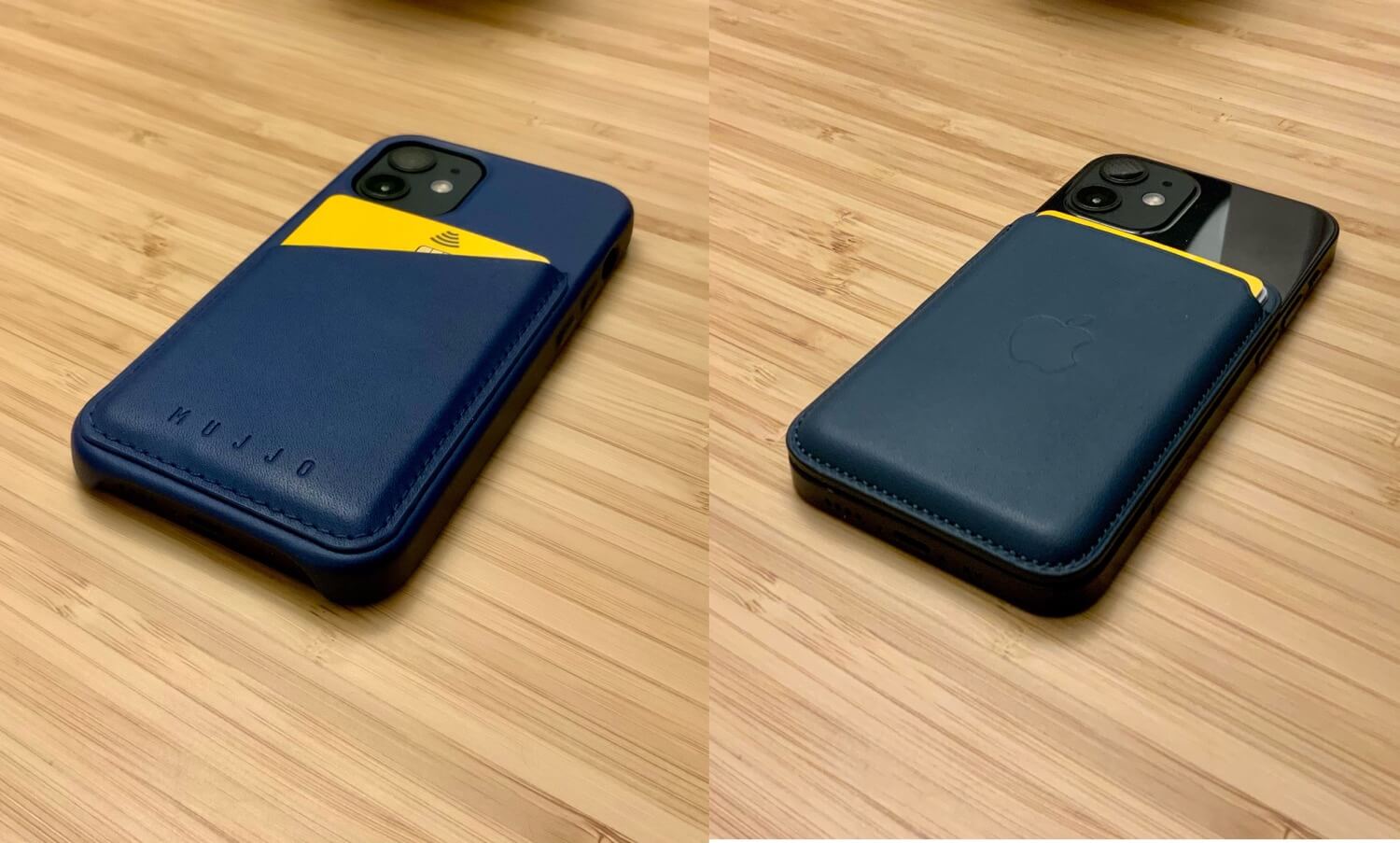
Here’s my Mini in two versions - with the Mujjo Wallet and with the MagSafe Wallet:
