Apple Watch series 5 review - the always-on screen is a huge deal!
⌚️Apple Watch
Last year both me and my wife upgraded the Apple Watch series 2 to 4. We skipped series 3 altogether as we were waiting for the cellular connection from our operator and it took them two years to figure that out. This year when Apple announced series 5 with practically nothing new… but just an always-on display - we had two different reactions - my wife thought “whatever” and I was like “finally!”. Now after more than 2 months with it, I have to say I totally stand by my first reaction. The “always-on display” is a huge deal, here’s why:

You can see the time like… all the time!
Yes, I know, Apple didn’t revolutionize the watch industry here. Traditional watches were always showing the time as this was all they did. They were just watches. Apple Watch is a tiny computer strapped on my wrist. It can do so much more… and now it can tell time… anytime!
No more tapping on the watch to see what time it is…
I just didn’t realize how many times I was making weird gestures with my previous watches, or tapping on the screen, to see what time it was.
Now I can just glance at it. Just. One. Discrete. Glance.
This is all it takes. And it’s been a bliss these past few months.
It’s almost perfect. Almost, because to read notifications I still have to tap on the screen first to wake it and only then it recognizes my swipe to get to the list of notifications. Please Apple, make this gesture seamless.
Other than that, it’s great. I also didn’t realize how often I really want to know what time it is and with a quick glance I’m done. It’s so much better now.
And I like the subtle change from “standby” to “on”.
I love how Workouts app works with this display
I’m doing more workouts now with the default Workouts app just because it works great with the new screen. It still shows you progress, but instead of milliseconds shows you seconds.
I hope these new screen APIs will be available to 3rd party developers like Strava. Let’s see.
My favorite watch face is “Nike Hybrid”.
I’ve almost always had Apple Watch Nike edition - series 2, 4 and now 5 - because of their watch faces. They’re very minimalistic and very readable. And digital. I’m not a watch nerd and I don’t really like the analogue watch faces.
I want to know the time, I don’t want to have to figure it out. And this is what an analogue watch face wants me to do.
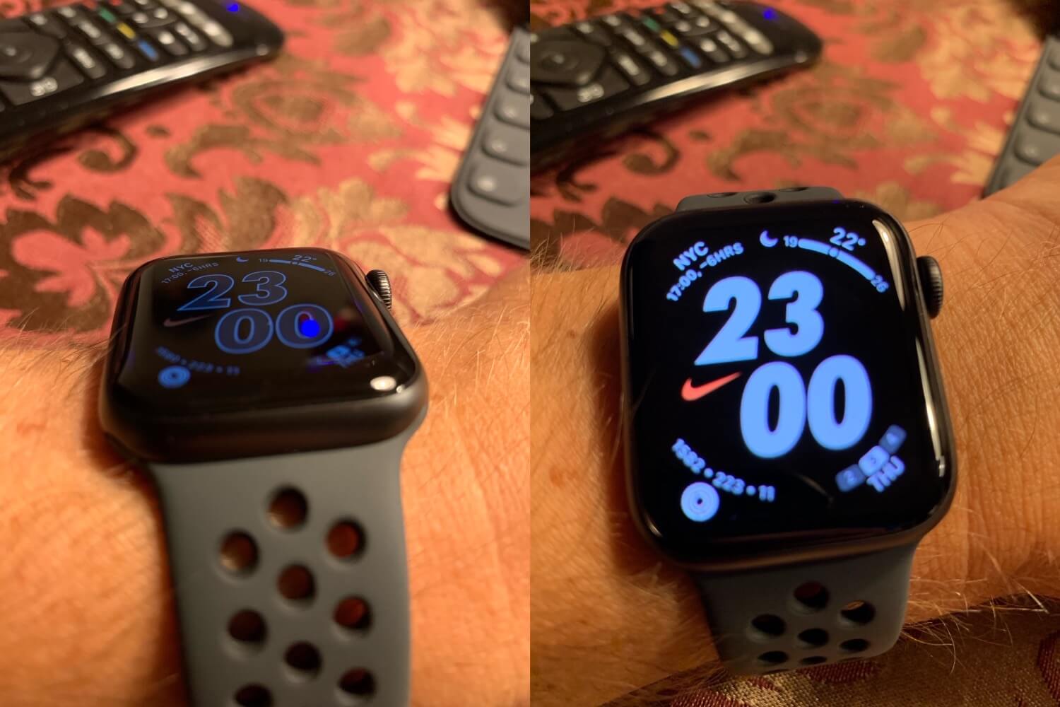
With WatchOS 6, Nike introduced new watch faces and now the “Nike Hybrid” (photo above) is my new default favorite. It’s got a large font for the actual time, a minimalistic feel, and yet 4 corner complications to tell me more than just time.
Currently I have:
- Top left: time in NY (USA EST) as most of my Nozbe customers come from there
- Top right: current temperature
- Bottom right: current day of the week and month
- Bottom left: my fitness circles (oh yes, I’m a “circle closer”!)
Keep loving the Apple Watch
I’ve been writing about the Apple Watch on my blog since the moment it launched. Recently I did my olympic-distance triathlon with it and it performed great.
I’m writing about the Apple Watch today, one day before the Christmas Eve, because I’ve given my father my previous gen Apple Watch - the series 4 - this Christmas… I mean, he got his gift early and he’s been using it for the last two months as well… and I can tell you that in his case it’s not just yet another gadget, but also a life-saving device with his regular heart problems. More on that, soon.
Want to know more about the Apple Watch 5, watch Rene’s review!
Rene Ritchie has a great 3-months-in review and if you’re interested, go check it out: