Removing features, noise and buttons to make your product perfect - like Apple Mighty Mouse
🍎Apple
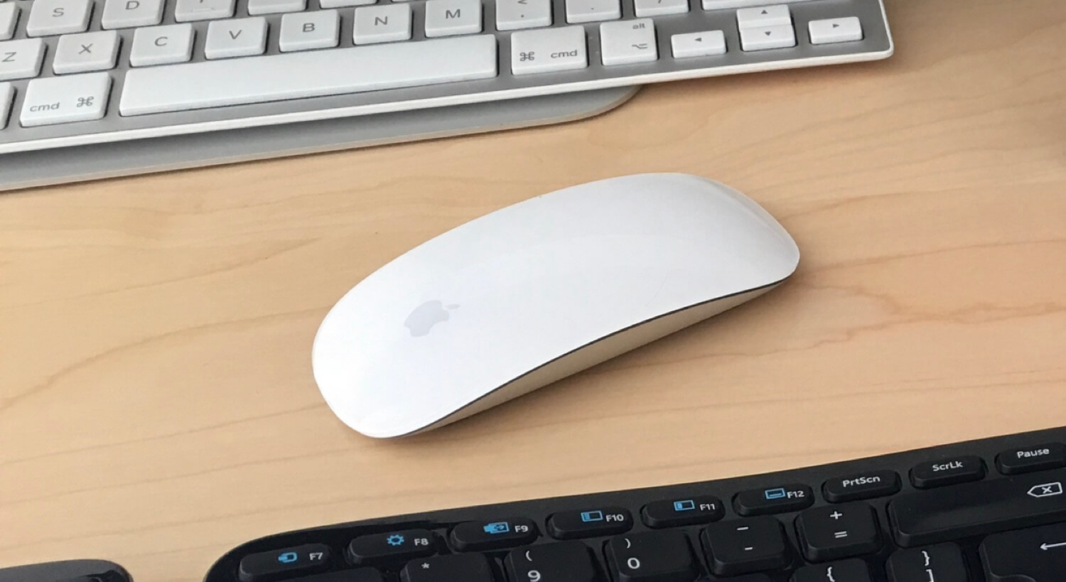
Today I visited our local Apple store to finally “feel and touch” the new Mighty mouse - world’s first multi-touch mouse. Man, it’s a beauty and pleasure to play with:

This tiny mouse looks like one of the most powerful mice in the world and yet…
… it has no buttons and no scrolling wheels!
So it basically lacks everything you’d expect from a mouse. And yet it’s so powerful! And this doesn’t mean you have to learn to use this mouse. Not really. Just move it around, click, scroll, right-click… Same old same old.
Plus it has new gestures even!
This the typical Apple genious - remove noise, remove unnecessary buttons but improve the user interface and the way stuff works “behind the scenes”.In the world where all mice manufacturers where adding buttons, scroll wheels, etc. - Apple removed them altogether.
As a startup owner/founder my goal with Nozbe 2.0 was to do the same thing: remove noise, remove buttons, sliders, dropdowns…And yet when I look at it I see there is still a lot that can be done… So I decided to do “weekly reviews” of Nozbe in a search for something to remove.
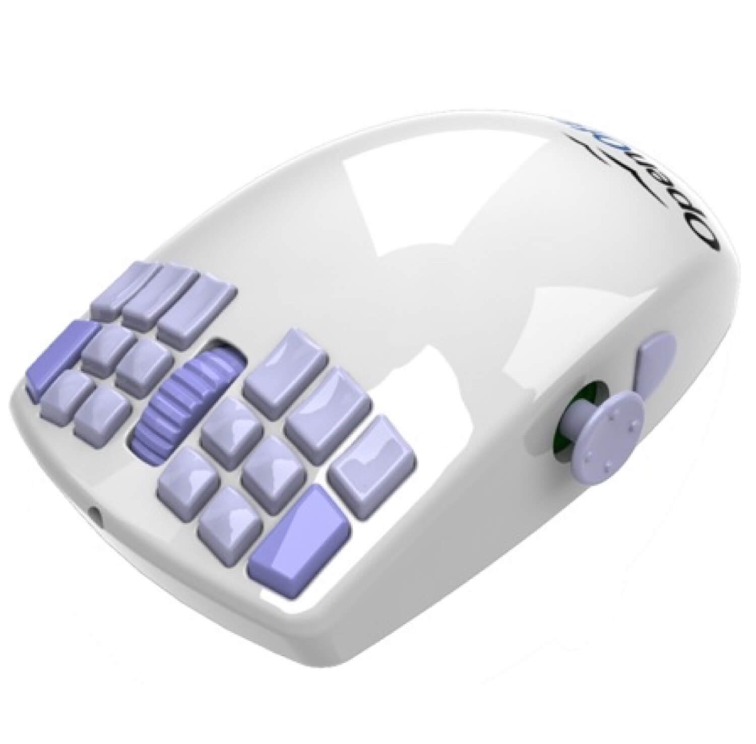
Compare that to what this might could have been if Apple decided to just keep adding features:

That’s right. I’ll be removing stuff from Nozbe. Literally.
Follow Apple’s advice:Keep removing noise while adding new features. Make stuff work “behind the scenes” and not “in your face”.