
Sub-projects suck — why 19 years of a flat structure made my app better
✔️Productivity,✅Nozbe,⭐️Featured
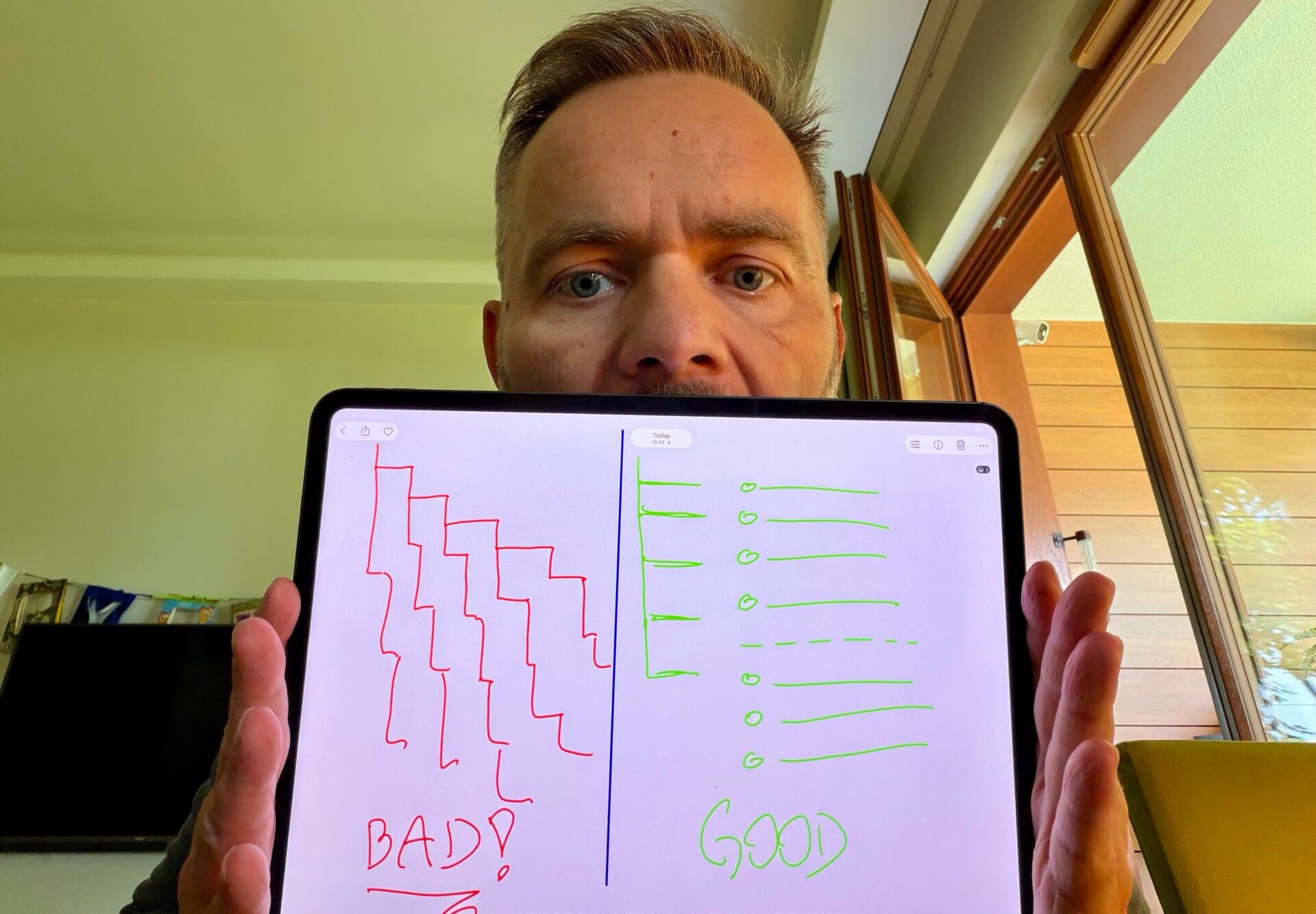
You open a new productivity app and you start getting organized with a hierarchy. Projects. Sub-projects. Tasks. Sub-tasks. This feels serious. This feels professional. You feel in control. Yet when you open my to-do app, Nozbe, you won’t find sub-projects or sub-tasks. For the last 19 years I’ve been refusing to give my customers these features because I’ve felt this added complexity and hierarchy go against the efficiency of getting things done. Turns out my hunch was correct and there’s some actual research behind this.
- The feature everybody asks for
- Why hierarchy feels so good… but works badly!
- 40 years of research: deeper means slower and more wrong
- How people actually organize when nobody’s watching
- Your head holds about four (4) things — not four levels!
- Scrolling is like falling… easier than climbing!
- But wait — doesn’t breaking things down help?
- What we give you instead: groups and sections
- You don’t need a task manager but a task do-er
The feature everybody asks for
Over almost two decades of running Nozbe I’ve heard it hundreds of times: “I’d switch to you tomorrow, but you don’t have sub-projects. C’mon Michael, it’s an obvious feature you’re missing!”
The answer has always been NO.
Not because it’s hard to build — it’s trivial to build. Because I’ve watched what happens to people who get it. And here’s my favorite part of the story: many of the customers who left us for an app with a beautiful nested tree came back. Not all of them, but many. Their message was almost always the same — the structure looked great, but it was harder for me to get things done.
Why hierarchy feels so good… but works badly!
Building a structure can feel satisfying. It’s tidy and it feels like progress. When you create “Marketing → Q3 Campaign → Website → Landing page → Copy”, you’ve just spent several minutes producing close to zero results. Worse, you’ve created a permanent tax. Every single time you want to add a task, you now have to answer the question “where does this belong?” — and every time you want to find it, you have to answer “where did I put it?”
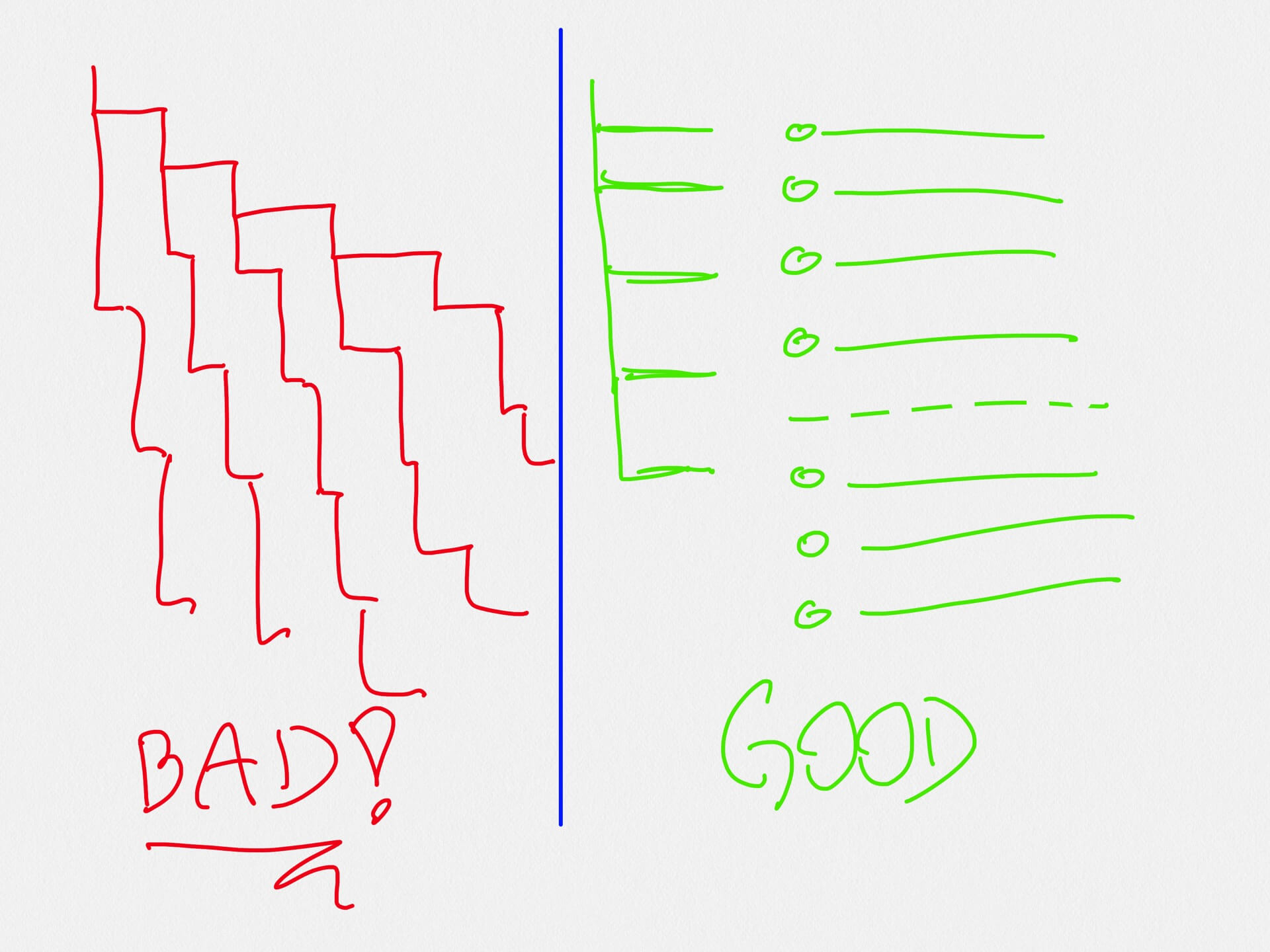
A hierarchy is a decision machine. It generates decisions forever. Deciding is exactly what you don’t need when you’re trying to execute.
40 years of research: deeper means slower and more wrong
Here’s what surprised me. Computer scientists have been testing this exact question — broad and shallow versus narrow and deep — since the early eighties, and the results are remarkably consistent.
1. People act fastest with shallow structures.
It started with Miller’s 1981 experiment1 on menu depth, replicated by Snowberry, Parkinson and Sisson in 19832 in the journal Ergonomics. Then Kiger in 19843 gave people the same 64 items arranged five different ways — from a narrow tree six levels deep to a broad one just two levels deep. The result: time and errors both increased as the structure got deeper, and the shallowest structures were the ones people liked most.
2. People double the error rate with complex structures.
Wallace, Anderson and Shneiderman (1987)4 added the detail that I find most relevant to real work. They compared a broad tree with a deep one, then put users under time pressure. The deep-tree users made 96% more errors and took 16% longer. In other words: the deeper structure works against you exactly when you’re busy — which, let’s be honest, is when you actually use your to-do app.
3. People perceive hierarchical structures… as more complicated!
Jacko and Salvendy (1996)5 confirmed again that the hierarchy people build to feel organized is the very thing making their work feel harder. They feel stressed by just looking at it!
Four decades, dozens of studies, one conclusion: when it comes to structure, expand in breadth, not in depth.
Complexity is not neutral. Complexity is a cost you pay every day, forever. The same is true of the structure inside your app. A five-level tree isn’t just prettier — it’s a small ongoing tax on every task you’ll ever create.
How people actually organize when nobody’s watching
Ofer Bergman and colleagues (2010)6 asked 296 people to retrieve 1,131 of their own real files from their own real computers, and analyzed all 5,035 navigation steps. The finding: people’s folder structures were shallow — the average file lived just 2.86 folders deep.
Nobody instructed them to work that way. Given complete freedom to build the elaborate tree of their dreams, humans quietly settle on something flat. The researchers concluded that people avoid deep structures because these cost them time!
So when I say Nozbe’s flat structure matches how people really work — this isn’t my opinion. It’s what people do when left alone.
Your head holds about four (4) things — not four levels!
Why does depth hurt so much? Because of a hard limit in your brain. George Miller’s famous 1956 paper7 put short-term memory at “seven, plus or minus two.” Nelson Cowan’s 2001 review8 revised that down to about four chunks — and four is the number that survived four decades of follow-up work.
Four. That’s your whole working memory while you navigate. Every level of hierarchy you traverse consumes some of it: Which branch was it? Did I file it under client or under project? Was that a sub-project or a section? By the time you find the task, you’ve spent your mental budget on looking for the work instead of getting it done.
Scrolling is like falling… easier than climbing!
There is a reason the most addictive social media apps entice you to keep scrolling. Why not use this pattern for something productive?
A flat project or task list asks nothing of your memory. You scroll. As I like to say: scrolling is like falling — it’s effortless, gravity does it for you.
Contrast that to digging through a structure of projects, sub-projects, tasks, sub-tasks and sub-sub-tasks! It’s quite the contrary. It feels like climbing.
But wait — doesn’t breaking things down help?
Yes. There is research pointing the other way — and it changed how we designed Nozbe.
Kruger and Evans (2004)9, in the Journal of Experimental Social Psychology, showed that when people list the individual steps of a task before estimating it, their estimates get dramatically more accurate — they cut the planning fallacy by more than half. The effect was strongest for complex tasks. Breaking work down genuinely helps.
And the most famous example of a simple list changing outcomes: the WHO Surgical Safety Checklist. In Haynes et al.’s 2009 study10 in the New England Journal of Medicine, across eight hospitals in eight countries, a 19-item checklist cut complications from 11% to 7% and in-hospital deaths from 1.5% to 0.8%.
Nineteen items on one piece of paper. Not a tree. A list. A flat (not hierarchical!) checklist.
That’s the whole distinction, and it took me years to articulate it: decomposition is good, hierarchy is not. You need to know the steps. You do not need a permanent nested structure to hold them.
That’s why in Nozbe we solved “sub-tasks” with checklists inside task comments. You get the breakdown — the steps, the detail, the “what does done actually mean” — without creating a new branch of the tree that you’ll have to maintain and navigate forever. And if a checklist grows too big to be a checklist anymore, you convert it into a project with one click. The structure appears when the work demands it, not before.
What we give you instead: groups and sections
We’re not against organization. We’re against hierarchy. So we gave our users two flat tools:
- Project groups — you can group projects together, and here’s the part a folder tree can’t do: one project can belong to several groups. For example “company website” project can belong to both Marketing and Development groups. In a tree, it would have to pick one. Reality doesn’t work that way.
- Project sections — a big project can be divided into sections you can collapse, reorder, and move tasks between. Many of our customers use them as a vertical Kanban. Again, it’s structure you can see in one scroll, no digging necessary.
Both give you the organization you actually wanted. Neither adds a level of depth. That’s the trick.
You don’t need a task manager but a task do-er
After all, what is my app for? Its goal is not to help you manage things in hierarchies. It is to help you get them done.
A flat vertical structure does not look as impressive as a nested tree of sub-sub-projects. It doesn’t screenshot as well. It doesn’t win the feature-comparison table on a competitor’s landing page. But it gets the job done — and now I know that four decades of research quietly agrees.
So here’s my challenge to you. Open whatever app you use and look at your deepest project. Count the levels. Then ask yourself honestly: how many of those levels are helping you do the work, and how many are just helping you feel organized about it?
Flatten one of them this week. See how it feels. In almost 20 years of running Nozbe, people have tried to prove me wrong and always failed.
Now I know there’s scientific research that backs me up. Links to the research below.
-
Miller, D.P. (1981), “The Depth/Breadth Tradeoff in Hierarchical Computer Menus”, Proceedings of the Human Factors Society 25th Annual Meeting, 296–300. Not online, but summarized in detail in this free University of Maryland report ↩
-
Snowberry, K., Parkinson, S. & Sisson, N. (1983), “Computer Display Menus”, Ergonomics 26(7), 699–712 — doi.org/10.1080/00140138308963390 ↩
-
Kiger, J.I. (1984), “The depth/breadth trade-off in the design of menu-driven user interfaces”, International Journal of Man-Machine Studies 20, 201–213 — sciencedirect.com ↩
-
Wallace, D., Anderson, N. & Shneiderman, B. (1987), “Time Stress Effects on Two Menu Selection Systems”, Proceedings of the Human Factors Society 31st Annual Meeting, 727–731 — this is the 96%-more-errors study; also summarized in the free UMD report above ↩
-
Jacko, J. & Salvendy, G. (1996), “Hierarchical Menu Design: Breadth, Depth, and Task Complexity”, Perceptual and Motor Skills 82, 1187–1201 — journals.sagepub.com ↩
-
Bergman, O., Whittaker, S., Sanderson, M., Nachmias, R. & Ramamoorthy, A. (2010), “The effect of folder structure on personal file navigation”, JASIST 61(12) — publisher version / free full PDF ↩
-
Miller, G.A. (1956), “The Magical Number Seven, Plus or Minus Two”, Psychological Review 63(2), 81–97 — free full text at Classics in the History of Psychology ↩
-
Cowan, N. (2001), “The magical number 4 in short-term memory: A reconsideration of mental storage capacity”, Behavioral and Brain Sciences 24(1), 87–185 — doi.org/10.1017/S0140525X01003922 ↩
-
Kruger, J. & Evans, M. (2004), “If you don’t want to be late, enumerate: Unpacking reduces the planning fallacy”, Journal of Experimental Social Psychology 40, 586–598 — sciencedirect.com ↩
-
Haynes, A.B. et al. (2009), “A Surgical Safety Checklist to Reduce Morbidity and Mortality in a Global Population”, New England Journal of Medicine 360(5), 491–499 nejm.org ↩