IMDB - how Apple’s iPhone or iPad interface makes ugly web site beautiful
📱iPadOnly,💻Computers
I live in Europe and I spent this Easter holidays with my family… and it was fantastic… but as a tech-geek my Easter celebration wasn’t complete… because I couldn’t buy an iPad :-(
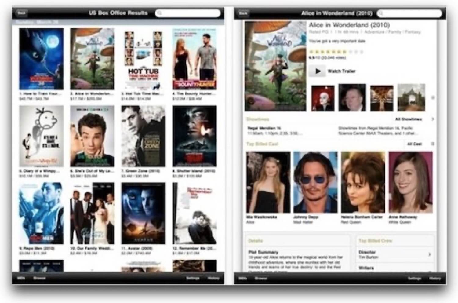
However I’ve been following the news and stories around the iPad and along the way I discovered some iPhone apps that I didn’t know ever existed. One of them is the IMDB iPhone app… and they just showed the iPad app:

I love movies and IMDB on the iPhone looks just great!
The thing is, I used to love the IMDB web site. Yes, the design of it is so-so, but it’s very functional and packed with great information and I can find out pretty quickly if a movie I’m about to see is worth my time (OK, other than the Quentin Tarantino movies - these have lots of raving fans on IMDB and his movies are in fact a waste of time and I don’t watch them by default).
The iPhone app I didn’t know about - IMDB app - makes the crappy IMDB website look cool
Really, if you start using their iPhone app, you won’t go back to their web site ever again. Seriously. It’s just better in every sense. Great interface, Movie descriptions feel just right, you can even watch a trailer right there via YouTube. Great usability.
Apple, thanks to their guidelines, forced beautiful interfaces on us. And that’s just good.
It’s all Apple’s fault. It’s really hard to build an ugly iPhone app if you’re following the Apple’s guidelines. And that’s what happened with the IMDB and many other web sites that have their apps - thanks to Apple, their content looks and feels just a lot better on an iPhone.
Constraints of a device play a significant role, too. Embracing constraints is what we all should do.
Another factor is the size of an iPhone or an iPad - the app developers know it and realize, that their content will look great on any iPhone and any iPad… as they are all the same and share the same resolution. Thanks to this fact, the engineers have to figure out a way to display their content on these tiny (iPhone) and not so tiny (iPad) screens. Forces them to make good decisions and build great apps.
Now, as we’re building a new app alongside Nozbe (and rolling out its iPad app), I’ll be thinking about these constraints and these “limited” UI elements all along to make sure we build something not only usable, but also beautiful.
Question: Did you enjoy your Easter without the iPad? Or did you get one? What’s your take on that?