Small/big font and the magic of Sass and CSS on my blog
⌨️Blogging
One of my favorite parts of this new blog project is re-learning new/old technologies. At Nozbe I don’t code anymore but programming still brings me joy so over here I get to learn modern JavaScript and CSS and HTML5 again. It’s cool to discover that most modern browsers support the latest technologies and it’s also exciting to see how the web conventions have developed over the years. Today let’s talk about styles, CSS and Sass.
Large or small font? I started with small but went larger
When I launched the website I went with a traditional 100% font size but when I looked at other websites I realized that right now the typography is going more into the direction of larger fonts. So I increased the font size a little bit as you can see in the photo above (before/after).
What do you think? Are you more of a traditional font size person or you prefer larger sizes for readibility?
Sass CSS
Styling has developed significantly over the years and recently this new technique of Sass CSS became a norm and for me it was a challenge but also a good experience to learn, use and embrace it: the variables, nesting and other goodies. It kept my code small and minimal. And very readable.
Like this:
.entry {
	padding: 0 5px 10px;
	a {
		text-decoration: none;
		background-color: $topw;
		@include dark-mode {
			background-color: $topb;
		}
	}
	p {
		padding: 0.8em 0 0.2em;
		font-size: 1.2em;
	}
	ul, ol {
		font-size: 1.2rem;
	}
}
It’s difficult at first but later it just changes the way you describe styles!
Relative sizes with “em” and “rem”
When I was designing websites years ago everything was pixel perfect but now it’s all about accessibility so the idea is to keep font sizes relative so I’m using “em” and “rem” all the time. This way people with eyesight problems can easily increase the size of text on my entire website.
“Rem” is “root em” and it makes sure that nested items don’t get bigger. Like when you have a size defined for a list and then add a list within the list and you want to keep it the same size.
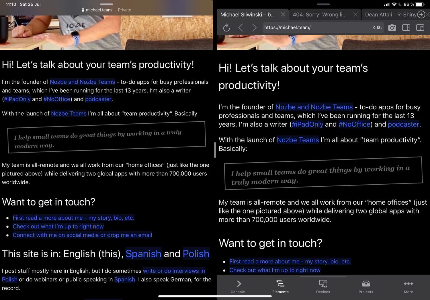
There’s an app for iPad that helps me with styles!
I’m mostly working on the iPad and there’s no “developer console” in iOS Safari, however there is a brilliant iOS app that does just that and you can see it on my screenshot above, it’s called Inspect Browser and it’s fantastic for debugging and testing CSS and HTML.
Why do I care so much and when do I learn all this?
Thanks to our Mighty Fridays/TGIF policy I have the time to study these things every Friday. And because according to Gallup Strengths Finder I’m a “Learner” I get lots of joy from learning this stuff.
I hope it was helpful and if you have any questions, ping me on social media.